Configuring Your First View
This step walks you through configuring three views against the built-in Person entity: a table to list people, a create form to register a new person, and a details view to display and edit an existing record. You will also wire a menu item so the table view is reachable from the main menu.
By the end of this step you will have a fully working CRUD experience without writing any backend code - everything is configured in the Shesha designer.
Form Versioning
Forms in Shesha have three versions, which together support a simple draft -> ready -> live workflow. Knowing how versioning works will help when you publish your first form.
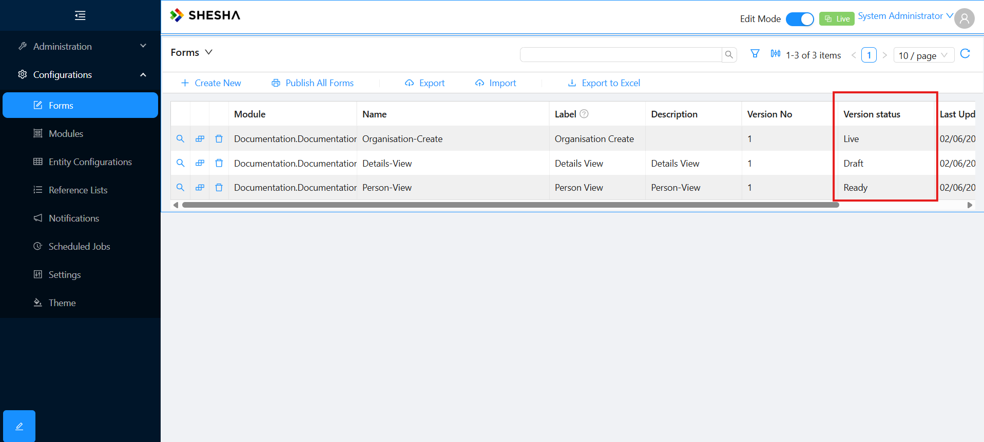
| Version | Purpose |
|---|---|
Draft | Work in progress. Designers can change fields and layout without affecting the version in use. |
Ready | Stable and reviewed. The system displays the Ready version where available, with a fallback to Live. |
Live | The version currently in use by end users. |
The typical flow is: build in Draft, finalise to Ready, then promote to Live. To make further changes, create a new draft. This keeps live forms protected from accidental edits while giving designers room to iterate.
Creating a New Form
Every form starts the same way: from the Forms configuration page.
- From the Main Menu, open Configurations > Forms.
- Click Create New on the toolbar.
- Fill in the form metadata.
| Field | What it means |
|---|---|
Module | The application module the configuration is saved under. |
Entity | The model type the form binds to. Determines which properties the form can read and write. |
Template | Default layout to start from (e.g. table-view, blank-view, details-view). |
Name | Part of the form's URL path. Must be unique within the module. Alphanumeric and dashes only. |
Label | Friendly name shown in lists. |
Description | Free-text notes about the form. |
Table View
You will start by building a table that lists everyone in the database.
1. Create the Table Form
Create a new form with the following values:
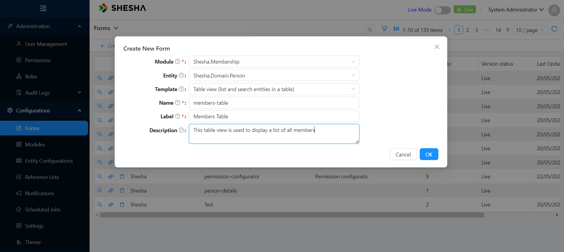
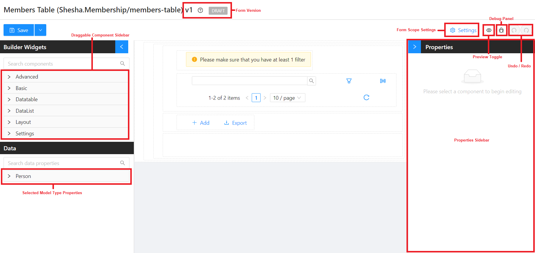
The designer opens with a pre-configured table layout based on the template. All you need to do is choose which columns to show and give the table a title.
2. Configure the Columns
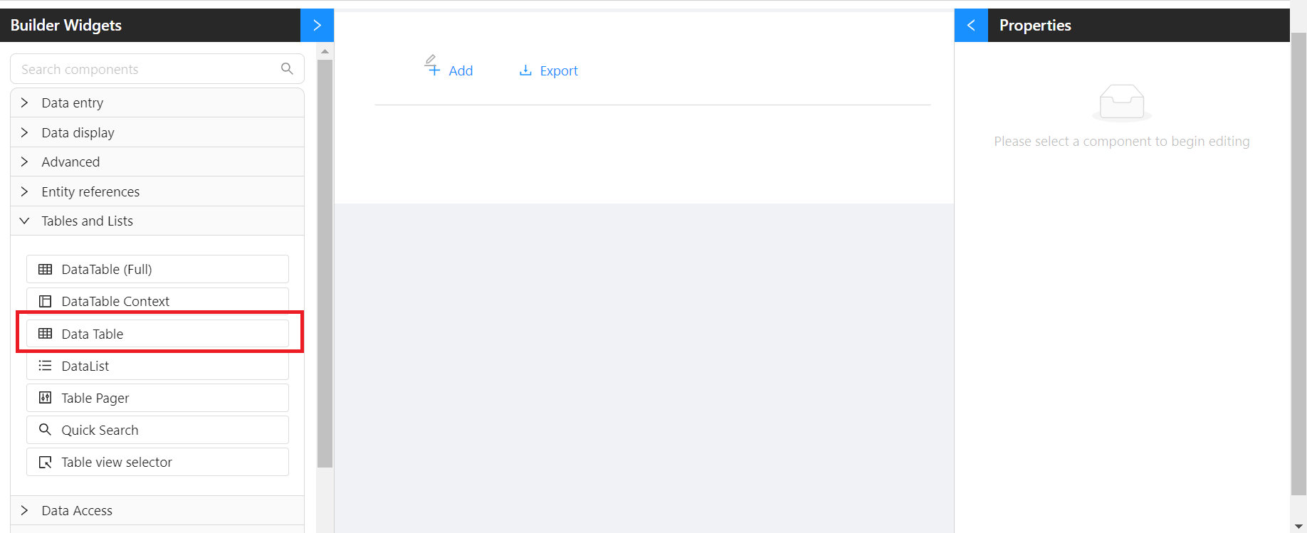
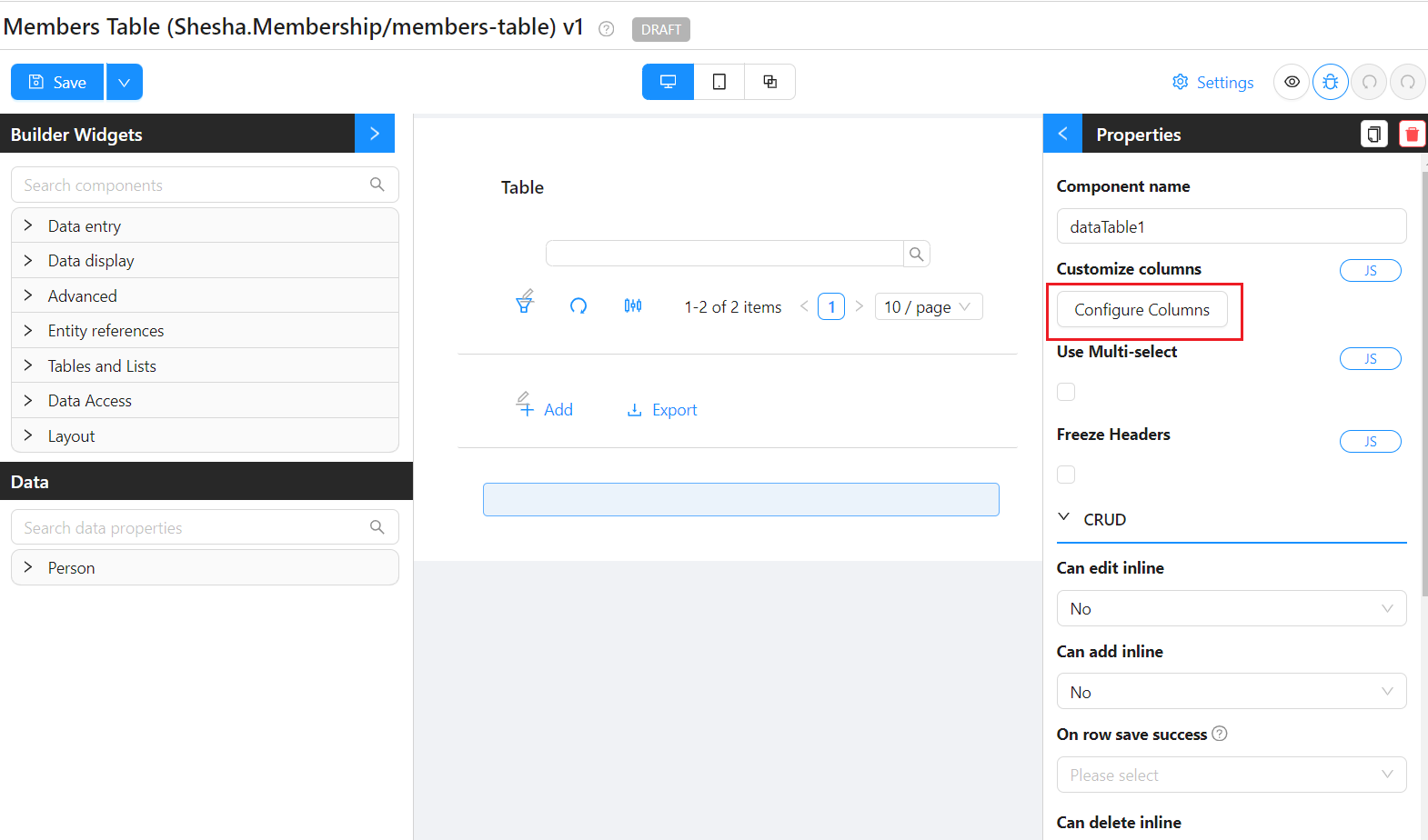
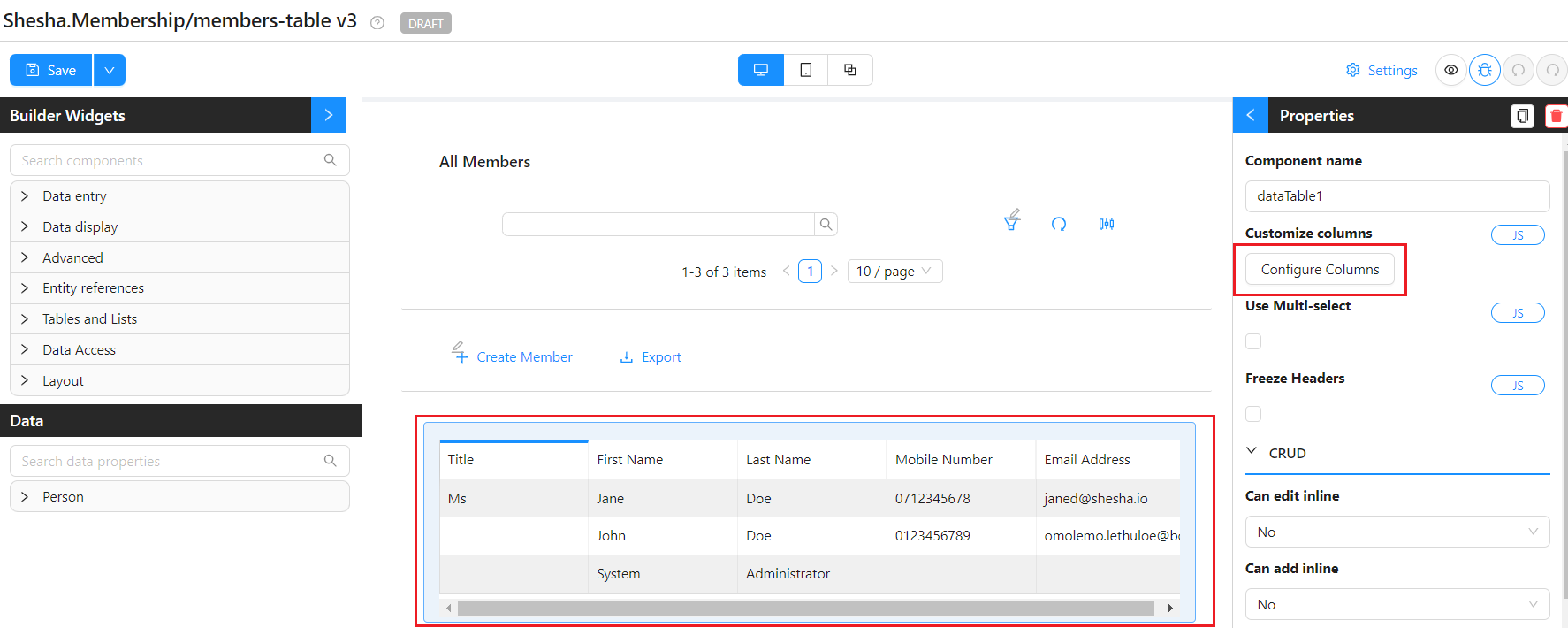
- Open the Tables and Lists group in the toolbox and select the datatable component on the canvas to see its properties.
- Click Configure Columns > Add Column.
-
On the Property Name setting, type to autocomplete from the properties available on the selected model. The lightning bolt button to the right copies the property name into the caption.
-
Add the following columns:
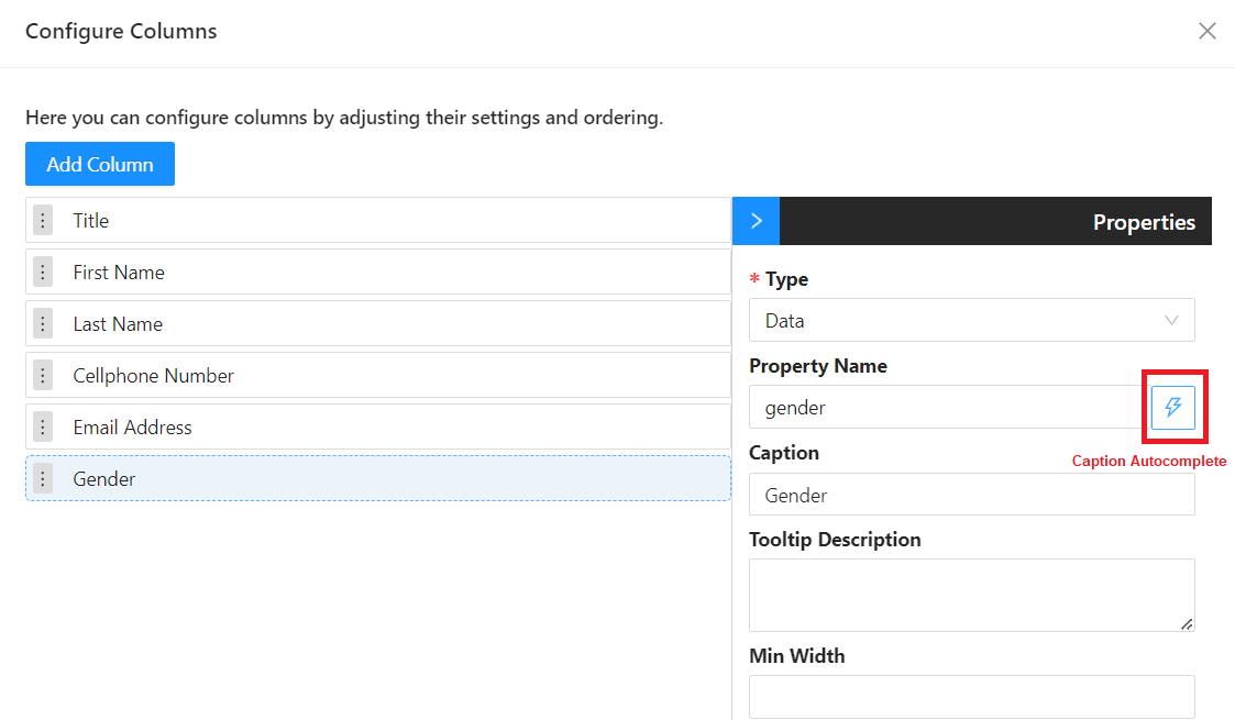
- Click Save on the Configure Columns modal.
The table now displays seeded Person records from the starter database.
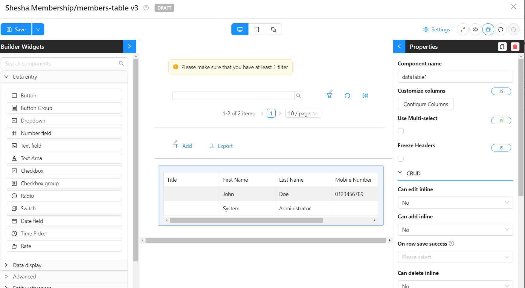
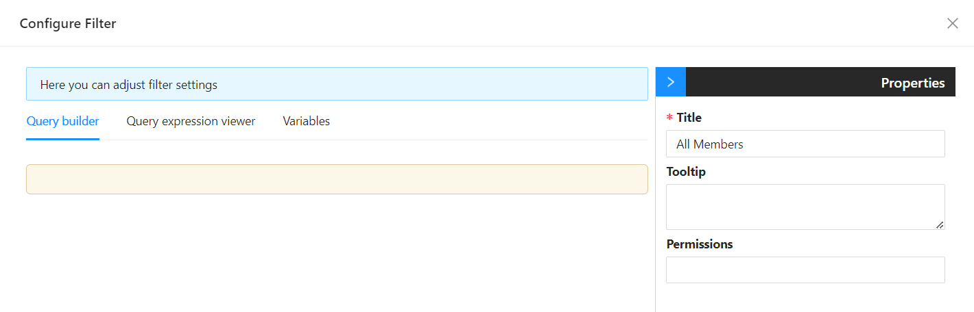
3. Add a Title via the Table View Selector
The Table View Selector component doubles as a heading at the top of the table.
- Select the Table View Selector component, then click Add Filter Item.
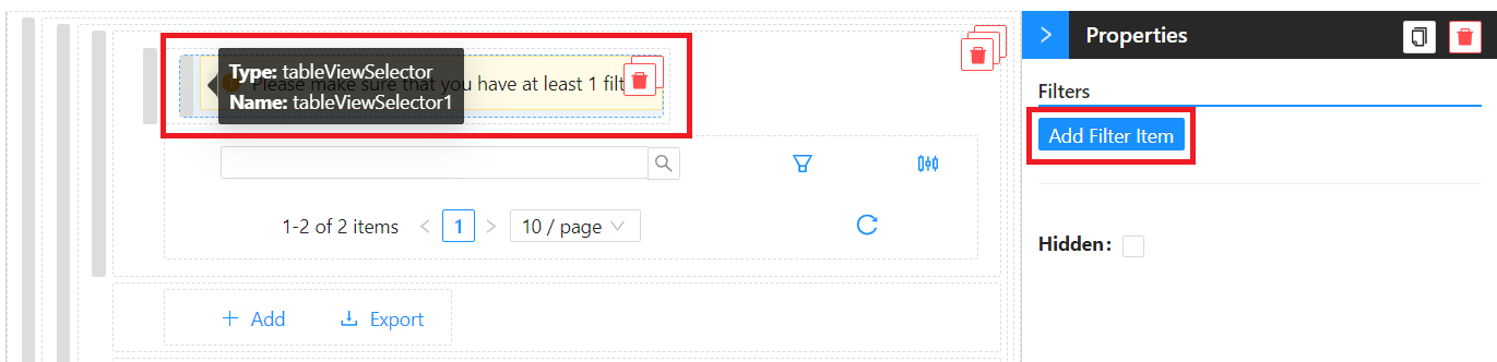
- Rename the filter to
All Members.
- Save the form.
Updating the Main Menu
To reach the new form, add it to the main menu.
- Toggle Edit Mode to allow changes to the menu.
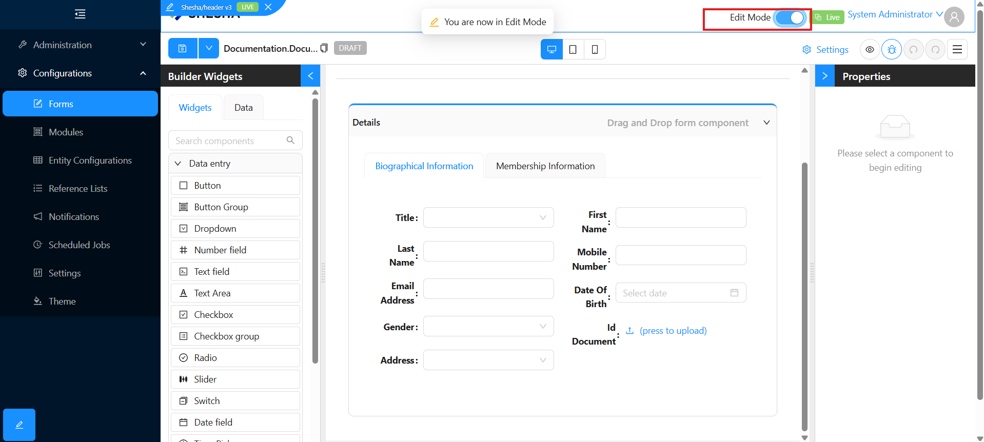
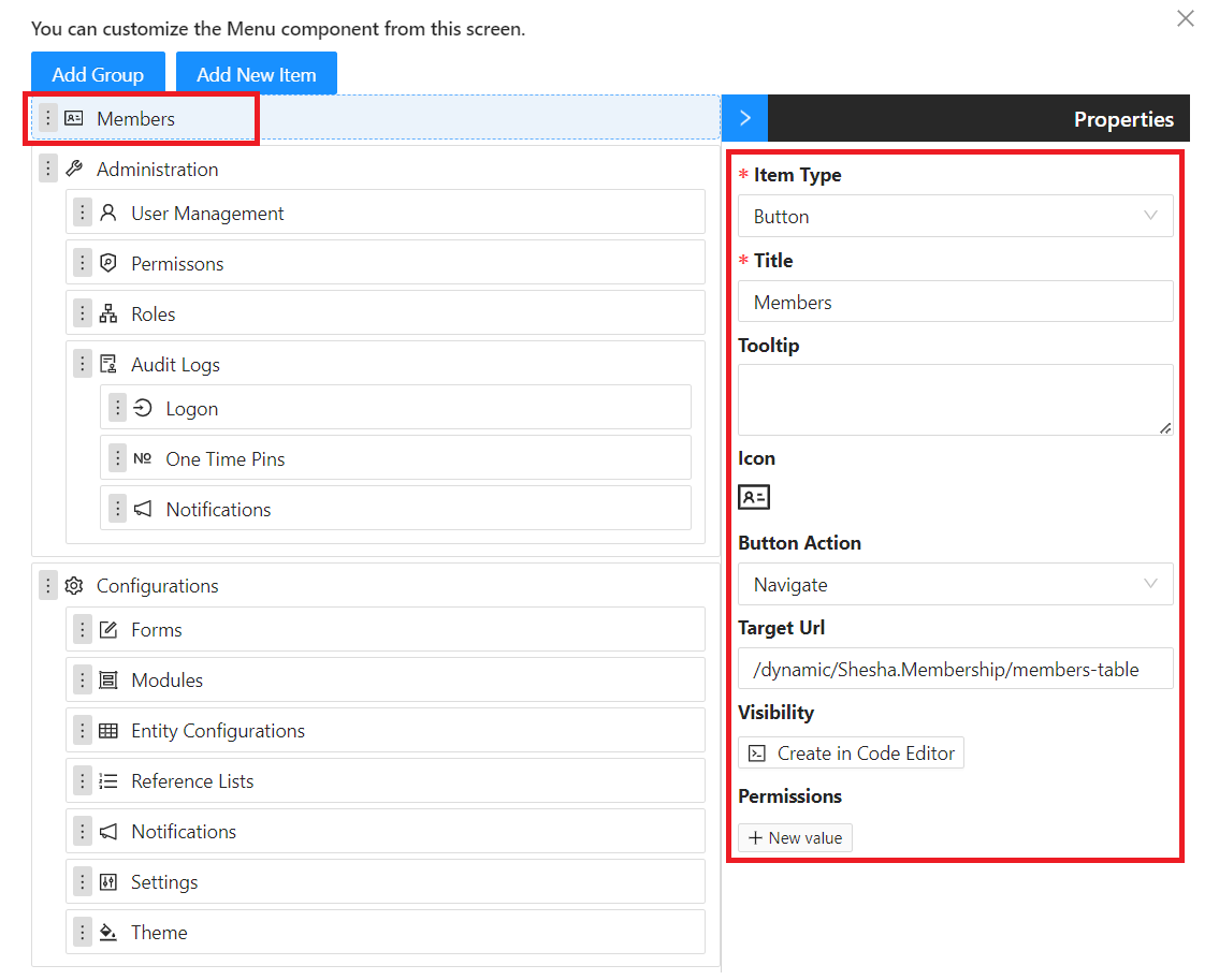
- Click the now-highlighted main menu to open the Main Menu Configuration dialog.
- Click Add New Item and set:
| Field | Value |
|---|---|
Item Type | Button |
Title | Members |
Icon | IdcardOutlined |
Button Action | Navigate |
Target Url | /dynamic/Shesha.Membership/members-table |
How the Target URL is built:
| Segment | What it means |
|---|---|
dynamic | Tells Shesha this URL points at a configured (dynamic) form. |
Shesha.Membership | The module the form lives in. |
members-table | The configured form's Name. |
- Toggle the switch to go back to live mode.
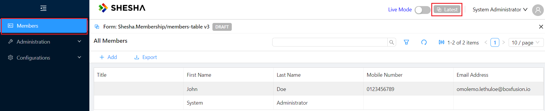
If your form is still in Draft, navigating to the menu item will not find it unless you switch the form versioning toggle from Live to Latest. Once published, switch it back.
Create View
Now add a form that lets users register new members.
1. Create the Form
Create a new form with these values:
| Field | Value |
|---|---|
Module | Shesha.Membership |
Entity | Shesha.Domain.Person |
Template | blank-view |
Name | member-create |
Label | Member Create |
Description | This create view is used to register a new member |
2. Add Fields
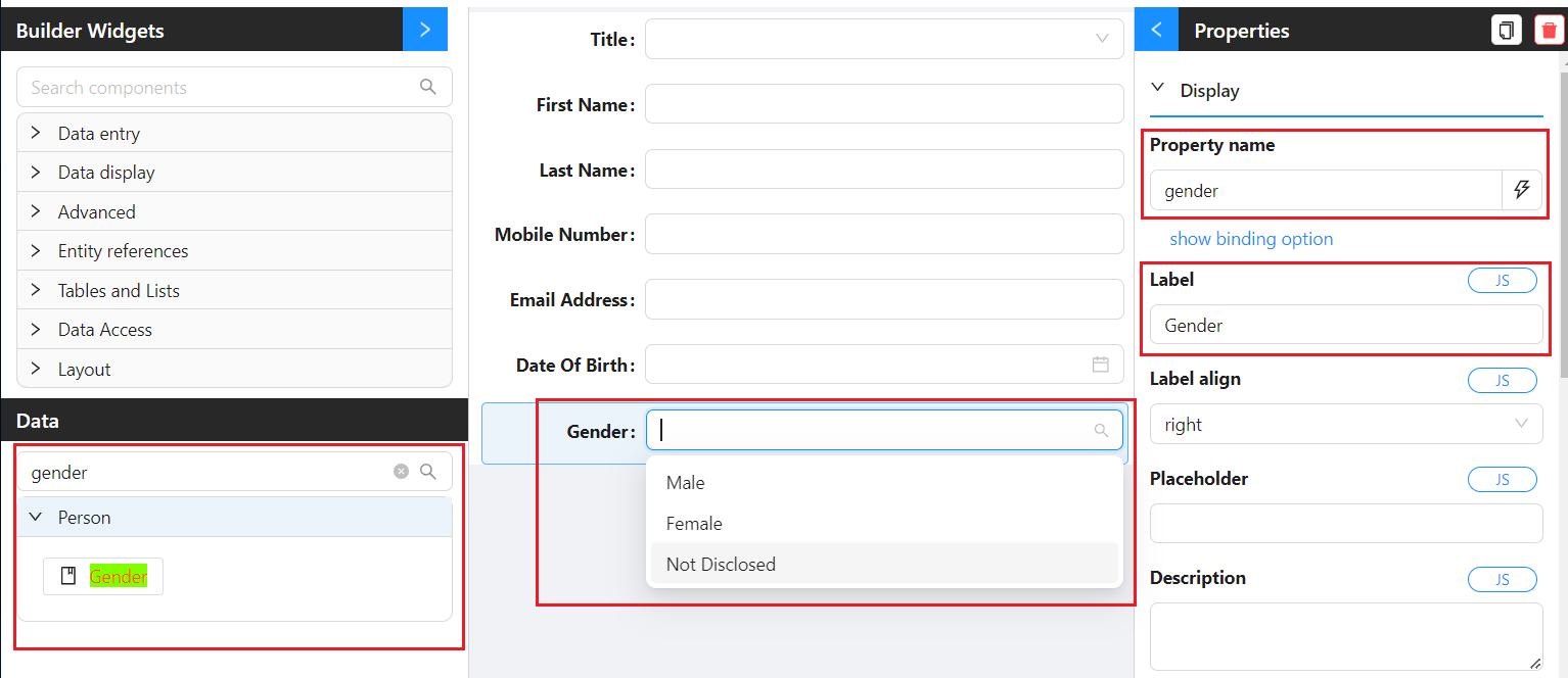
On the Data Panel, drag the following properties onto the Edit Area, autocompleting or changing labels as needed:
| Property |
|---|
firstName |
lastName |
mobileNumber1 |
emailAddress1 |
dateOfBirth |
gender |
Shesha automatically binds each property to a sensible default component (text fields for strings, date pickers for dates, etc.) based on the property's data type.
3. Swap a Default Component for a Dropdown
To show how to replace the default component, swap the title field for a dropdown bound to a reference list.
- Search for
dropdownin the Builder Widgets and drag it onto the edit area. - Set its
Property Nametotitle. - Click the lightning bolt next to the caption to autocomplete.
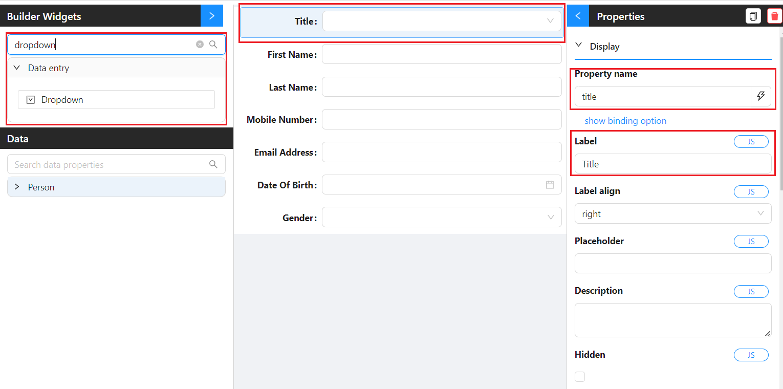
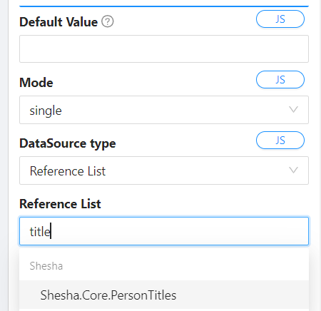
- Set the Reference List the dropdown sources its options from, for example
Shesha.Core.PersonTitles.
Custom Validations
For a full walkthrough of writing custom validation rules, see the Adding custom validations how-to guide. The example below shows a quick property-level validation rule.
Disabling Dates Before 1990
On the dateOfBirth component:
- Set Disabled Date Mode to Custom function.
- In the Disabled Date func editor, return a boolean indicating whether the current date should be disabled.
Example - Disabling all dates before 1990:
const year1990 = moment("1990-01-01");
return current && current < year1990;
Marking the Field Required
Toggle the Required property on the Date Of Birth component.

Save your form.
Adding a Button to Open the Create View
Now wire up a toolbar button on the members table so users can open the create form from there.
Accessing the Form Designer
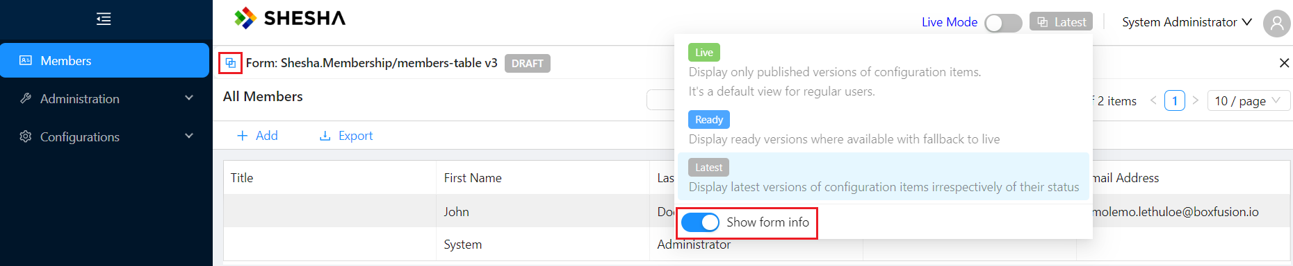
There are two ways to get back to a form's designer:
| Method | How |
|---|---|
From the rendered view | Open the menu item, toggle Show form Info on the versioning toggle, then click the shortcut icon next to the form info. |
From the Forms list | Open Configurations > Forms, search for your form, and click the form designer icon. |

Configure the Button
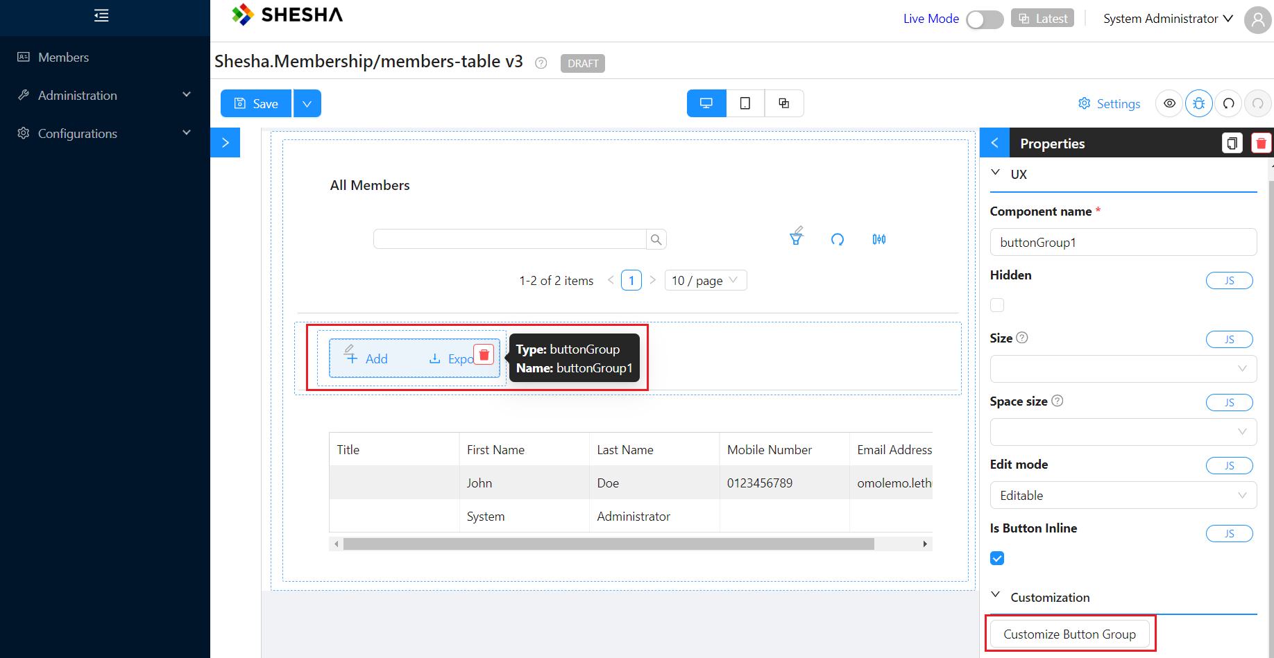
- Click the Button Group component and then Customize Button Group.
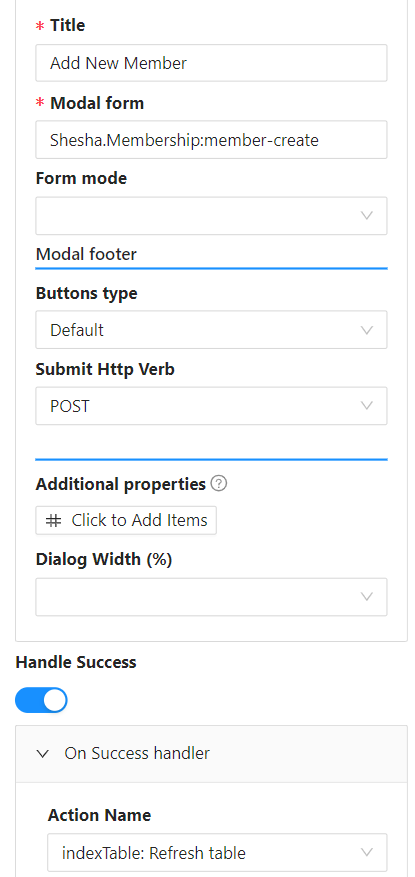
- Edit the Add button:
| Field | Value |
|---|---|
Label | Create Member |
Button Type | Link |
Action Name | Common > Show Dialog |
Title | Add New Member |
Modal Form | member-create |
Show Modal Buttons | True |
Submit HTTP Verb | POST |
Handle Success | True |
Action Name (on success) | indexTable: Refresh table |
- Save the Button Group customisation, then save the form.
- From the main menu, navigate to the members table and refresh the page if needed.
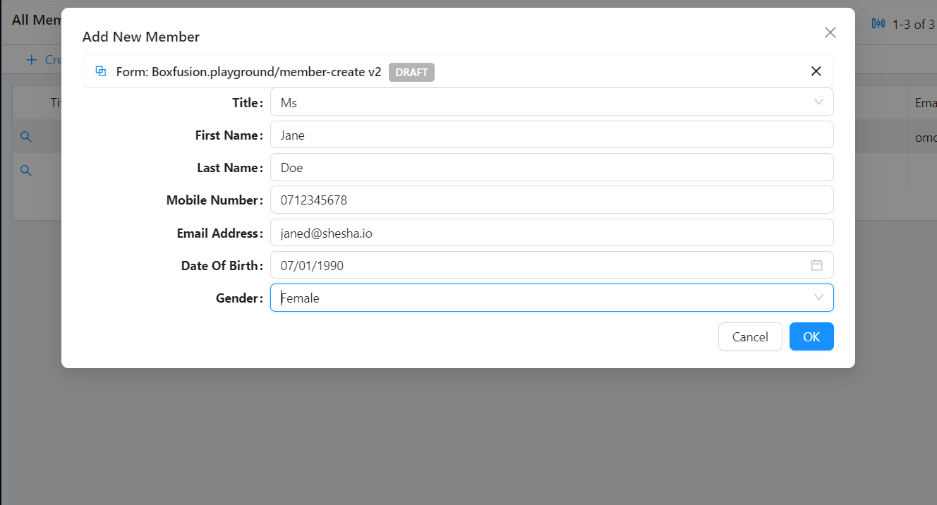
- Click Create Member, fill in member details, and click OK.
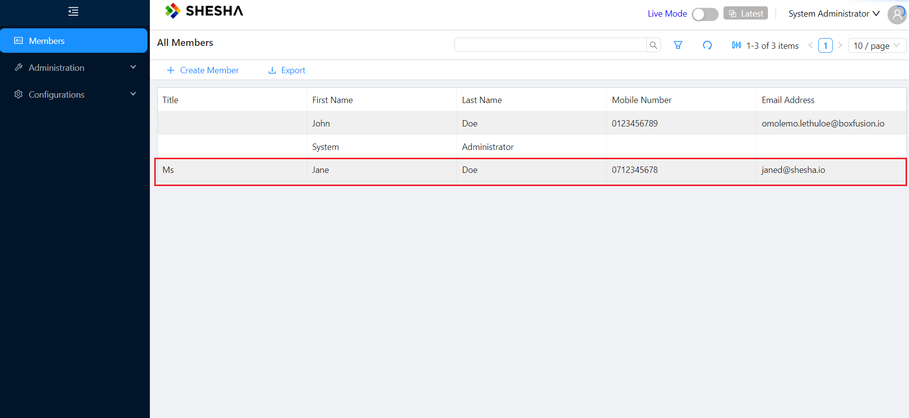
- Once the table refreshes, the new record appears.
Details View
Now add a form that shows and edits the details of a single member.
1. Create the Form
Create a new form with these values:
| Field | Value |
|---|---|
Module | Shesha.Membership |
Entity | Shesha.Domain.Person |
Template | details-view |
Name | member-details |
Label | Member Details |
Description | This details view is used to view the details of a member |
The details-view template comes with a default panel pre-configured. You only need to set up the layout and fields.
2. Lay Out the Form
- Delete the default
nametext field that ships with the template. - For a cleaner layout, drag a column component from the Builder Widgets into the existing Panel component. The defaults give you a two-column layout. To customise further, see the columns component reference.

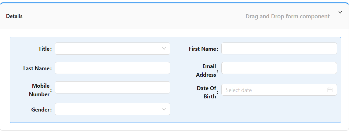
- On the Data Panel, drag the following properties onto the columns:
3. Add a Dynamic Title
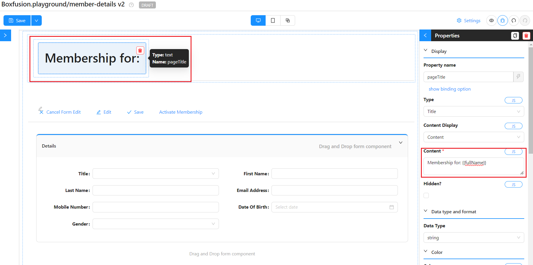
Shesha uses Mustache templating syntax for dynamic text. Anywhere you can write a string in the designer, you can include {{propertyName}} tags that get replaced with the corresponding value from the form's data object.
- Select the text component and set its Content to:
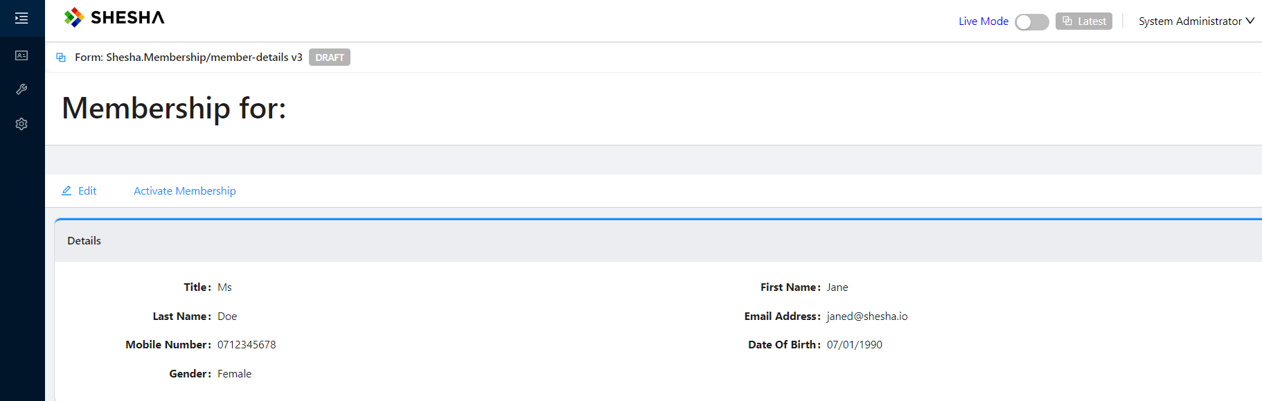
Membership for: {{fullName}}
The text component now reads from the loaded record and displays the person's full name.
Navigating from Table to Details View
The final step is to let users drill from the table into a specific member's details view.
- Open the members-table form designer.
- Select the datatable component and click Customize Columns.
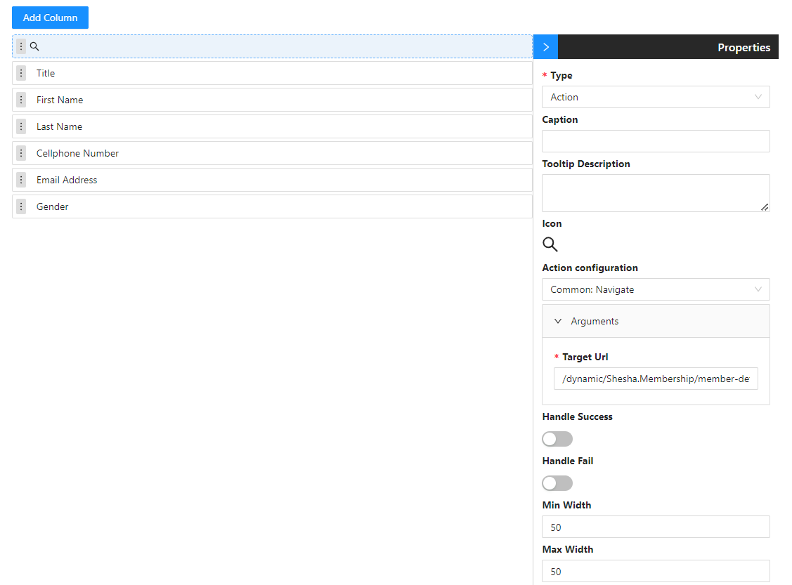
- Add a new column:
| Field | Value |
|---|---|
Type | Action |
Caption | (leave empty) |
Icon | SearchOutlined |
Min Width | 50 |
Max Width | 50 |
Action Name | Common > Navigate |
Target Url | /dynamic/Shesha.Membership/member-details?id={{selectedRow.id}} |
How the Target URL is built:
| Segment | What it means |
|---|---|
dynamic | Tells Shesha this URL points at a configured form. |
Shesha.Membership | The module the form lives in. |
member-details | The form's Name. |
?id={{selectedRow.id}} | Passes the selected row's id as a query parameter. See the selectedRow reference for the full object. |
- Save the column customisation, then save the form.
- From the main menu, navigate to the members table and refresh the page if needed.
Clicking the search icon on a row now navigates to the details view for that member.
Next Step
Continue with Extending the Domain Model to add a custom Member entity and a reference list for membership status.