Radio
The Radio component allows users to make a single selection from a predefined set of options. It supports dynamic data sources, orientation control, and custom styling.

Properties
The following properties are available to configure the behavior of the component from the form editor (this is in addition to common properties).
Data
Items
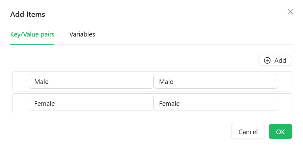
Define label-value pairs for the radio group directly.