Dropdown
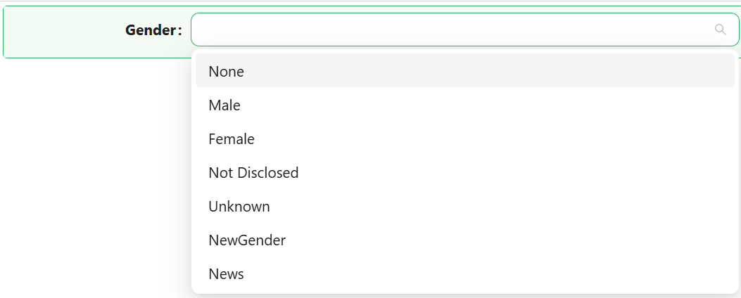
The Dropdown component offers users a sleek and powerful way to select one or more options from a list. It supports custom data sources, label/value configuration, and advanced filtering.

Properties
The following properties are available to configure the behavior of the component from the form editor (this is in addition to common properties).
Data
Mode Object
Switch between single (default), multiple, or tag selection.
DataSource Type Object
Choose how the dropdown gets its values: from static values (default), reference lists, or a remote URL.
Value
Manually define the dropdown entries via label-value pairs. Ideal for short, custom lists.
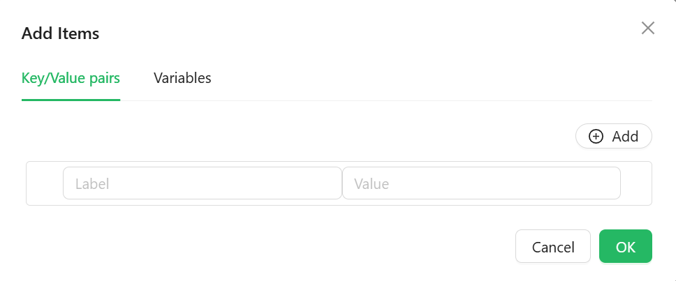
Note: Click the Variables pane to see the variables, descriptions and datatypes allowed