SizableColumns
The SizableColumn component enables the configuration of column layouts with resizable dimensions, making it useful for responsive or flexible grid-based designs. Each column can be defined in terms of its width, min/max boundaries, and additional styling.
Properties
The following properties are available to configure the behavior of the component from the form editor (this is in addition to common properties).
Common
Component Name string
A unique key used to reference this component in your data model. (Required)
Hide boolean
Determines whether the component is visible in the form.
Data
Columns sizableColumnsConfig
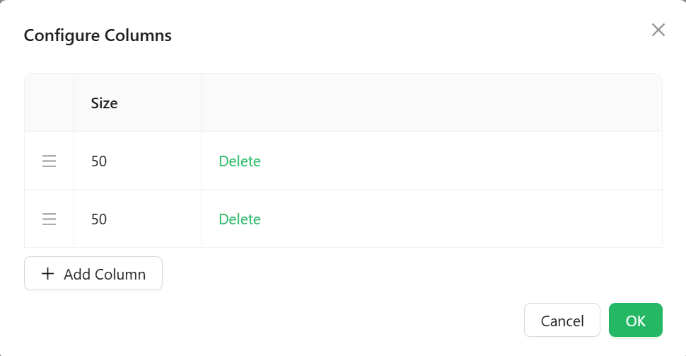
Defines the layout and settings for columns in the container. A GUI editor helps configure widths, spacing, alignment, and content placement.
Appearance
Dimensions
Adjust column width and height via:
- Width
string
- Min Width
string
- Max Width
string
- Height
string
- Min Height
string
- Max Height
string
(Supports any valid CSS unit likepx
,%
,em
)
Border object
Toggle visibility and customize:
- Width, color, style
- Border radius
Background object
Options include:
- Solid color
- Gradient
- Image (upload or URL)
- Stored file references
Shadow object
Apply shadow with offset, blur, spread, and color.
Margin & Padding object
Adjust internal and external spacing of the component.
Custom Style* function
Provide a JavaScript function that returns a CSSProperties
object to dynamically style the component.