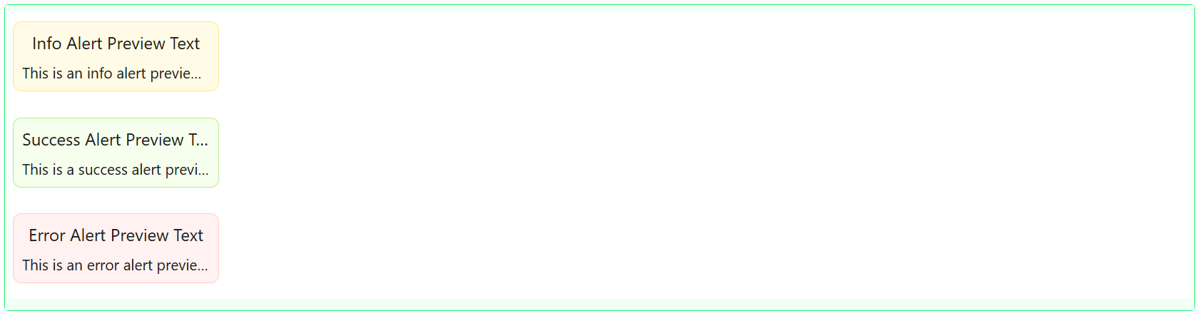
Key Information Bar
The Key Information Bar component displays essential data in a compact, styled row or column format. Great for summaries and quick insights, it supports fully customizable layouts and styling per item.

Properties
The following properties are available to configure the behavior of the component from the form editor (this is in addition to common properties).
Common
Columns keyInformationBarColumnsList
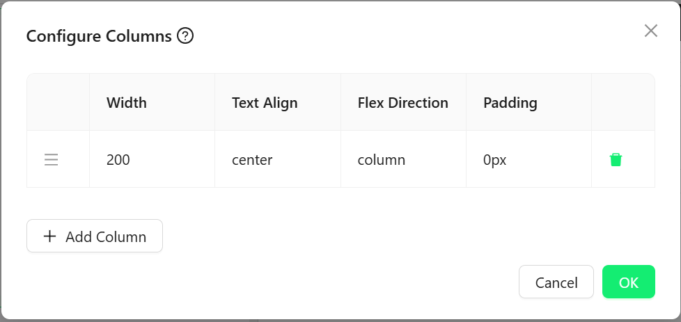
Defines the layout and contents of each key information column.
Appearance
Orientation object
Defines layout direction:
- Horizontal (default): Items laid out in a row.
- Vertical: Items stacked in a column.
Gap number
Spacing between columns/items.
Divider object
Configure a divider line between items with properties for margin, width, height, thickness, and color.