Kanban
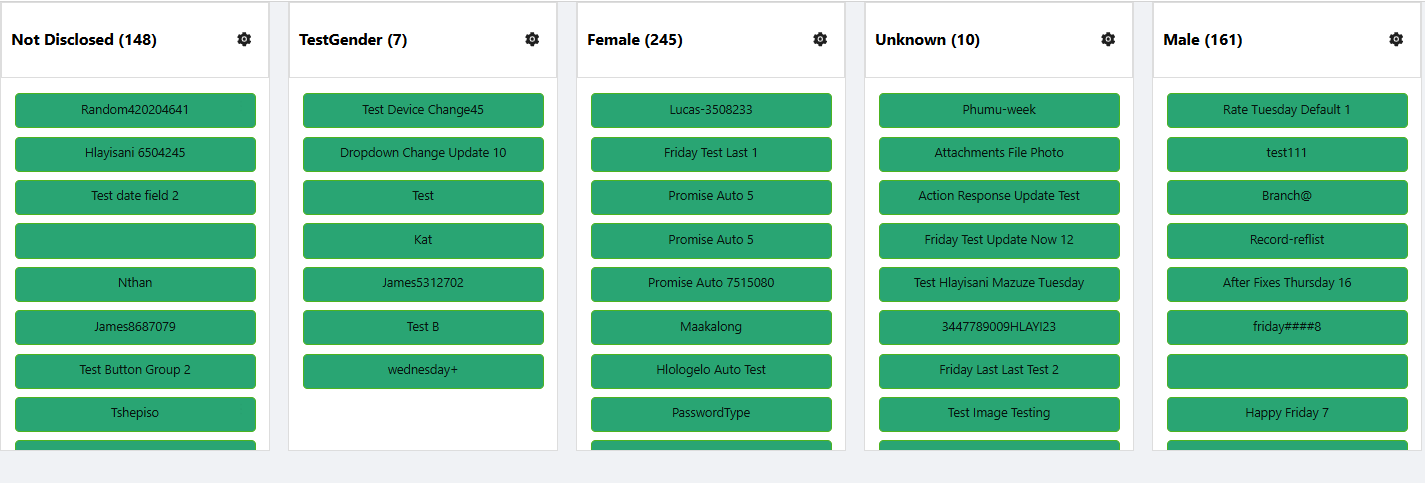
The Kanban board is a visual project management tool that helps teams organize tasks and track their progress. It provides a clear overview of the status of each task, allowing users to move task cards between columns such as "To Do," "In Progress," and "Done."
Properties
The following properties are available to configure the behavior of the component from the form editor (this is in addition to common properties).
Common
Render Form object
The modal form that opens when a card is clicked. (Required)
Grouping Property string
Field in your data model used to categorize items into columns. (Required)
Readonly boolean
Disables drag-and-drop and editing capabilities.
Allow Delete boolean
Toggles the ability to remove cards from the board.
Show Icons boolean
Toggles icon visibility on card headers.
Allow New Record boolean
Allows users to add new items to the board.
- Create Form
This option will appear when
Allow New Recordis enabled. You can select the form that will be used to create new tasks.
Allow Edit boolean
Enables in-place card editing or modal editing.
- Edit Form: This option will appear when
Allow Editis enabled. You can select the form that will be used to edit existing tasks.
Collapsible boolean
If this option is enabled, you will be able to collapse each column to save space and reduce visual clutter.
Appearance
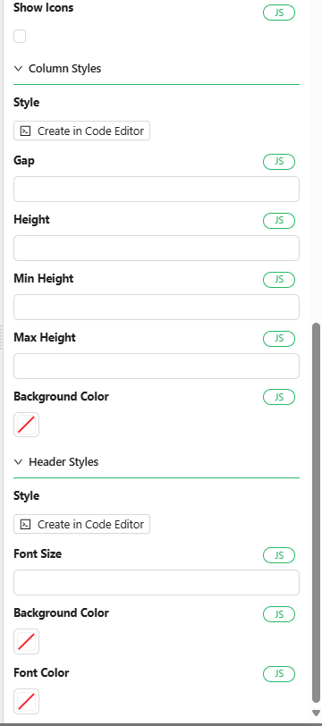
- Gap: This property specifies the space between columns, giving you control over the layout and spacing
Data
Reference List object
The list used to define columns on the board. Re-select if reference list items are modified.
Items object
Selector for customizing which reference list items appear as columns.
Features
- Drag and Drop: Easily move cards between columns with a simple drag-and-drop interface.
- Customizable Columns and Cards: Adjust columns and cards to suit your specific workflow and project needs.
- Collapsible Cards: Minimize individual cards to reduce clutter on the board.
- Customizable Styles: Modify the appearance of the Kanban board to fit your preferences, from colors to fonts.
How to Configure the Component
Location of the Component
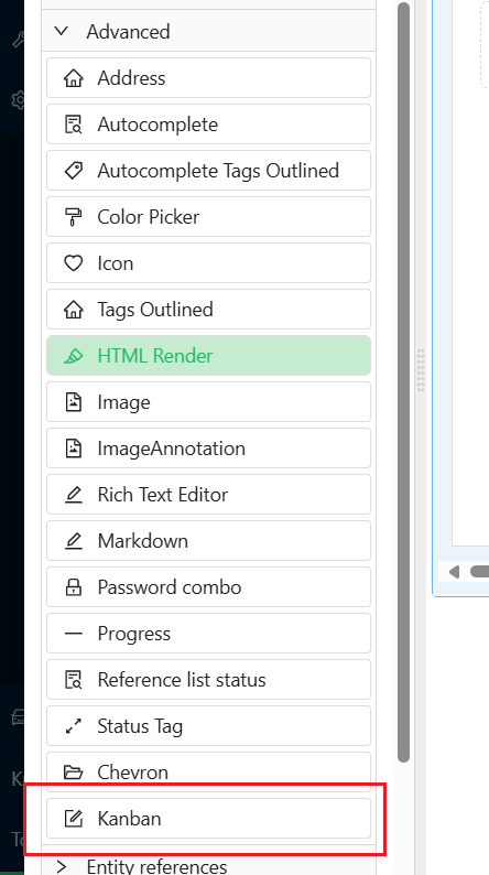
The Kanban Component can be found under the Advanced group in the form designer.
Configuration Steps
Follow the steps below to configure the Kanban Component:
1. Add the Component
-
Navigate to the Advanced group in your form designer.
-
Drag and drop the Kanban Component onto your form.

2. Configure the Component Properties
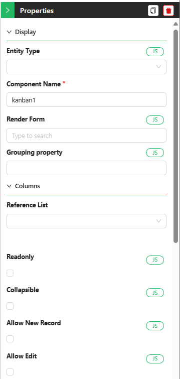
Display Section
-
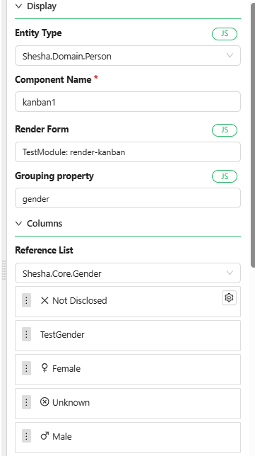
Entity Type: Choose the entity from which the component will pull data. This selection will enable auto-complete functionality for other properties. For example, you might select the entity
Personif your tasks are related to people. -
Component Name: Provide a unique name for this component, especially if more than one Kanban board is being used within the same form. This helps in identifying and managing different boards.
-
Render Form: Select the form that will display the details for each task. This form defines how individual tasks will be rendered on the board.
-
Grouping Property: Choose the property by which tasks will be grouped into columns. This property should typically be of the type
reference-list(e.g.,status,priority, orgender). -
Max Result Count: Specify the maximum number of tasks to be fetched from the database and displayed on the board.
Columns Section
-
Reference List: Select the reference list that will categorize the tasks. For instance, you might choose a list like
statusto organize tasks by their current state (e.g.,To Do,In Progress,Done).-
Once the reference list is selected, all items within that list will be displayed as columns.
-
You can reorder the columns based on your preferences to better match your workflow.
-
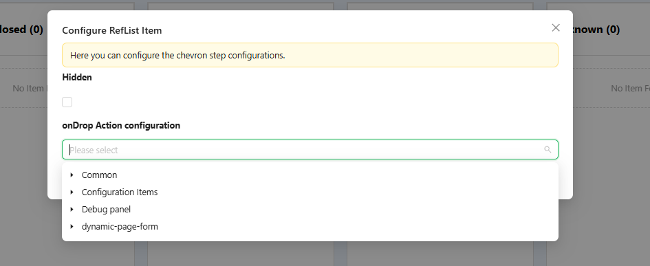
Each column will display a gear icon when hovered over, allowing you to configure actions specific to that column. For instance, you can define what should happen when a task is dropped into a particular column, or choose to hide certain columns.
-
When you click the gear icon, a configuration window will appear, enabling you to define specific actions for each column.
-
After this, your Kanban board should have a basic structure and functionality, though without custom styling applied yet.