Color Picker
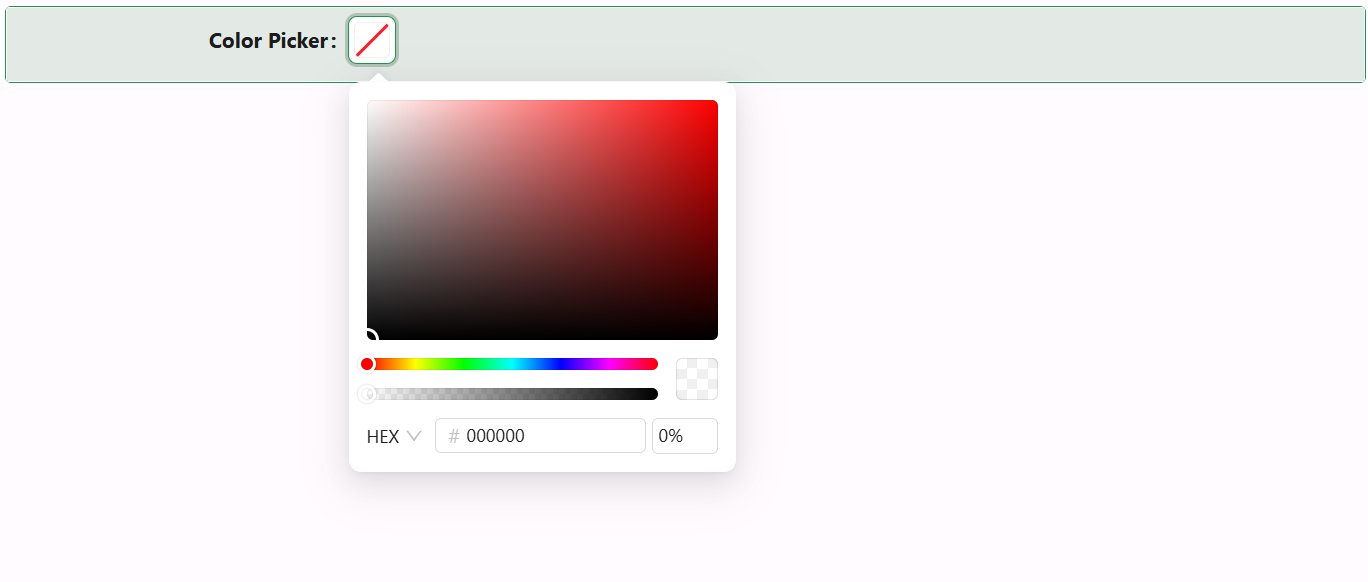
The Color Picker component enables users to select colors from a visual palette or enter their own values. It supports custom titles, hex/rgb display, opacity control, and full design customization.
Properties
The following properties are available to configure the behavior of the component from the form editor (this is in addition to common properties).
Data
Allow Clear boolean
Enables a clear button to reset the selected color.
Show Color Code boolean
Displays the hex or RGB value alongside the color preview.
Disable Opacity boolean
Disables the ability to select transparency or alpha values.