Radio
The Radio component lets users pick a single option from a small, always-visible set of choices. Its options can come from a fixed list you type in, a reference list, or a URL you fetch at runtime.

Properties
The following properties are available to configure the behavior of the component from the form editor (this is in addition to common properties).
The panel is organised into three tabs: Common, Events, and Appearance. Properties below appear in the same order as the live panel.
Common
The Common tab starts with the standard Property Name, Label, Tooltip, Visible, and Interaction Mode settings described in common properties, followed by the two panels below.
Data
A collapsible panel on the Common tab.
Data Source Type object
Chooses where the radio options come from.
| Option | Description |
|---|---|
Values | Define label/value pairs directly in a dialog editor. |
Reference list | Populate options from a selected reference list. |
API URL | Fetch options from a custom endpoint at runtime. |
Items object
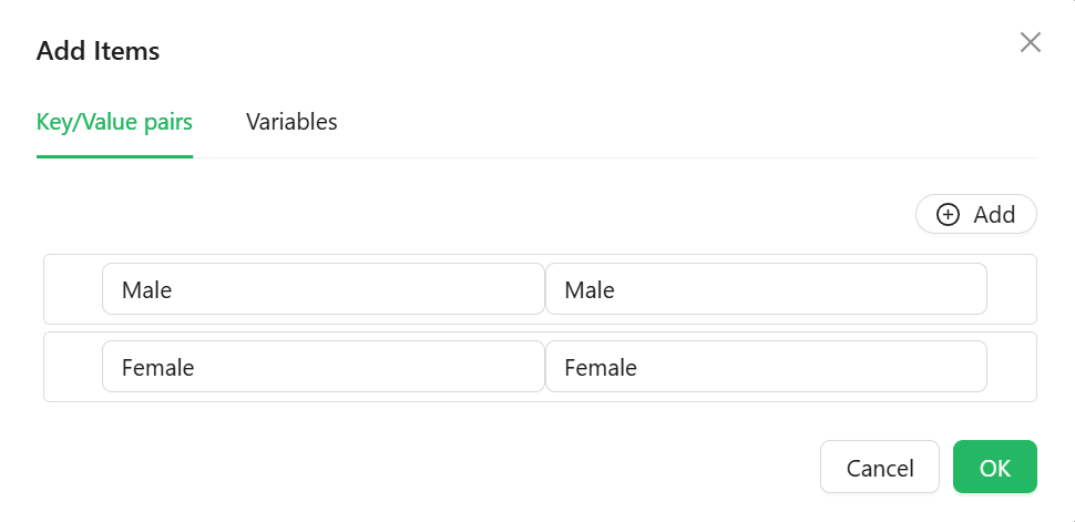
Shown only when Data Source Type is Values. Opens a dialog editor for typing in label/value pairs. The Value column uses the expression editor, so a value can be calculated rather than typed.
Reference List object
Shown only when Data Source Type is Reference list. Picks which reference list supplies the options. If the component's Property Name is bound to a reference-list-typed entity property, this is filled in automatically.
Data Source URL function
Shown only when Data Source Type is API URL. A script that returns the URL to fetch options from.
Reducer Function function
Shown only when Data Source Type is API URL. A script that reshapes the raw fetched response into the label/value pairs the component needs.
Form type to use: Any form type - Radio is available in every script context.
Example - Map a custom API response into label/value pairs:
return data.map((item) => ({ label: item.displayName, value: item.code }));
Validations
A collapsible panel at the bottom of the Common tab.
Required boolean
The form cannot be submitted while no option is selected.
Message string
The text shown when validation fails, in place of the default message.
Custom Validator function
Your own validation rule, written as a script that returns a promise.
Events
The Radio exposes the standard event handlers described in common properties: On Change, On Focus, On Blur, On Click, On Mouse Enter, On Mouse Move, On Mouse Leave, On Key Down, and On Key Up.
Appearance
Direction object
Lays the options out Horizontal (the default) or Vertical.
Horizontal works well for two or three short options. Once the labels run to more than a couple of words, Vertical is far easier to scan and does not wrap awkwardly on a narrow screen.
Radio Style
A collapsible panel styling the radio buttons themselves, with its own Dimensions, Border, Background, Shadow, Margin & Padding, and Custom Styles settings, separate from the component's outer box.
The tab also holds the standard Font, Dimensions, Border, Background, Shadow, Margin & Padding, and Custom Styles panels, configurable per device.