Button Group
The Button Group component offers a flexible way to present a set of action buttons in a single row or column layout. With options for layout orientation, spacing, and complete styling control, it's ideal for organizing grouped actions in a visually consistent manner.

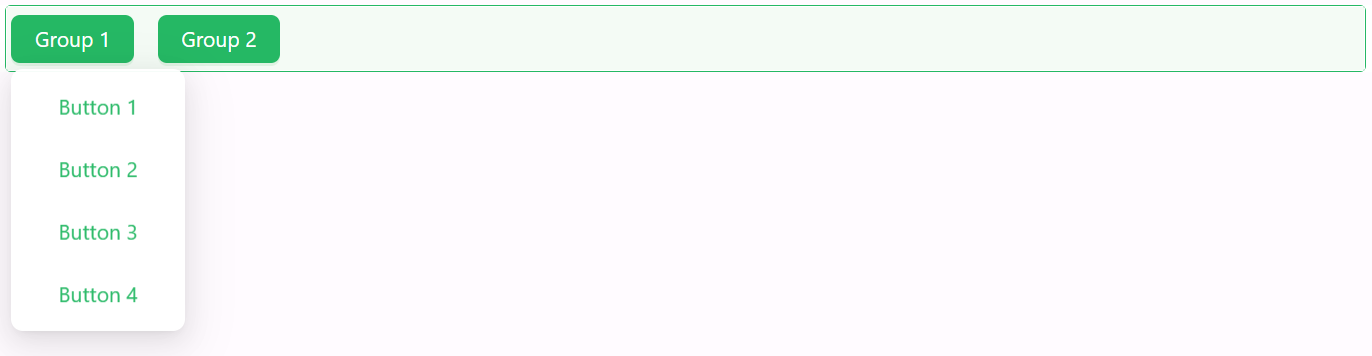
Properties
The following properties are available to configure the behavior of the component from the form editor. These are in addition to the common properties shared by all Shesha components.
The panel is organised into Common and Appearance tabs.
Common
Configure Buttons object
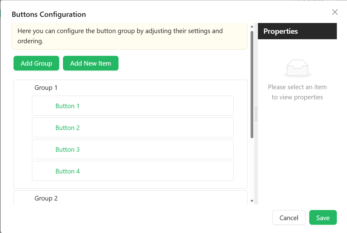
Configure the buttons and groups shown in the component using a visual builder. Each entry in the list is either a Group or a Button, and each opens its own settings drawer. A group has Common and Appearance tabs; a button has Common, Events, and Appearance tabs.
Group
Used to nest multiple buttons under a common label, for example a dropdown of related actions.
| Property | Type | Description |
|---|---|---|
Group Name | string | Internal identifier for the group. Required. |
Label | string | The text shown on the group. |
Group Tooltip | string | Tooltip displayed when hovering over the group. |
Icon | string | Optional icon shown next to the group label. |
Down Icon | string | Optional icon shown to indicate the group expands, such as a chevron. |
Button Type | object | The button style used for the group trigger. One of default, primary, dashed, link, text, ghost. Defaults to default. |
Interaction Mode | object | See the common Interaction Mode property. |
Visible | boolean | Whether the group is shown. Permissions can be set on this setting with the lock icon beside it. |
Hide When Empty | boolean | Automatically hides the group if none of its child buttons are currently visible. |
Groups have no Security tab. Permissions are set on the group's Visible and Interaction Mode settings using the lock icon beside each, so a group can be hidden from some users and merely disabled for others. See Permissions.
Button
Used to define an individual button, a visual separator, or a set of dynamically generated buttons.
| Property | Type | Description |
|---|---|---|
Item Type | object | What this entry renders as: Button (default), Separator, or Dynamic item(s). |
The next fields are shown only when Item Type is Button:
| Property | Type | Description |
|---|---|---|
Name | string | Internal identifier for the button. Required. |
Caption | string | The text shown on the button. |
Tooltip | string | Helper text displayed on hover. |
Icon | string | Optional icon shown beside the caption. |
Icon Position | object | Start or End. Only shown once an icon is selected. |
Interaction Mode | object | See the common Interaction Mode property. |
Visible | boolean | Whether the button is shown. Permissions can be set on this setting with the lock icon beside it. |
Action Configuration | object | Defines what happens when the user clicks this button, configured the same way as the Button component's Action Configuration. |
When Item Type is Dynamic item(s), a Dynamic Items Configuration field replaces the fields above, letting you generate buttons from a provider (for example, one button per record returned by an entity or URL data source).
Each button's Appearance tab exposes a Type setting (the same default / primary / dashed / link / text / ghost options as the group's Button Type) plus the standard Font, Dimensions, Border, Background, Shadow, Margin & Padding, and Custom Styles groups. A Separator item instead shows Thickness and Color fields for the dividing line. A button's permissions are set on its Visible and Interaction Mode settings using the lock icon beside each, rather than on a Security tab. For a Dynamic item, the Events and Appearance tabs are shown only when the provider is an Entity or a URL.
Is Button Inline boolean
Displays buttons as inline-flex elements to keep them aligned in a single line.
Appearance
Gap object
Spacing between buttons.
| Option | Description |
|---|---|
small | Minimal spacing between buttons. |
middle | The default spacing. |
large | Increased spacing between buttons. |
The remaining Appearance settings (Dimensions, Border, Background, Shadow, Margin & Padding, Custom Styles) follow the same common style properties shared by all components.