Checkbox Group
The Checkbox Group component allows users to select one or multiple options from a list. Whether you're letting users choose their interests or settings, this component brings clarity and control with every click.


Properties
The following properties are available to configure the behavior of the component from the form editor (this is in addition to common properties).
Common
Mode object
Toggle between single and multiple selection modes depending on the use case.
Data
Data Source Type object
Choose the source of checkbox items: from predefined values, a reference list, or a remote API.
Items
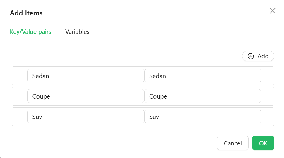
Manually enter label-value pairs for the checkboxes. Useful for static lists.
Appearance
Direction object
Decide if the checkboxes are arranged horizontally or vertically.