Kanban
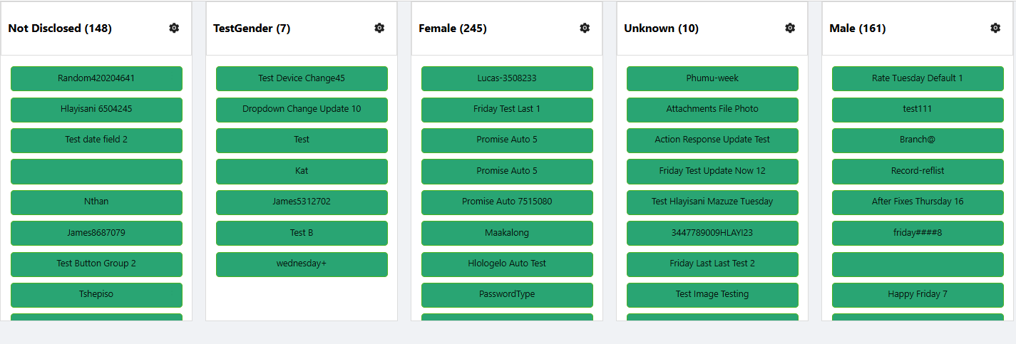
The Kanban board is a visual project management tool that helps teams organise tasks and track their progress. It provides a clear overview of the status of each task, letting users move task cards between columns such as "To Do," "In Progress," and "Done."
Kanban does not fetch its own data or define its own entity type. It must be placed inside a Data Table Context component, and reads the records that context has already loaded. Settings such as the entity type and the maximum number of records to fetch belong to the surrounding Data Table Context, not to Kanban itself. If Kanban is not inside a Data Table Context, the designer shows "Kanban must be used within a Data Table Context" instead of the board.
Properties
The following properties are available to configure the behaviour of the component from the form editor (this is in addition to common properties).
Common
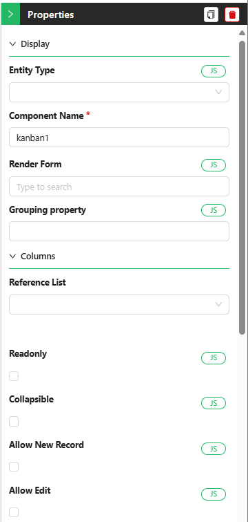
Component Name string
A unique name for this Kanban instance, separate from the common Component Name convention used elsewhere - required so multiple boards on the same form can be told apart.
Render Form object
The form that opens in a modal when a card is clicked, used to display or edit the task's details. Required.
Grouping Property string
The field on your data model used to group items into columns. This should be a reference list property, such as status or priority. Required.
Collapsible boolean
When enabled, each column can be collapsed to save space and reduce visual clutter. Hidden when Readonly is on.
Readonly boolean
Disables drag-and-drop, editing, and deleting cards.
Allow Delete boolean
Toggles the ability to remove cards from the board. Hidden when Readonly is on.
Show Icons boolean
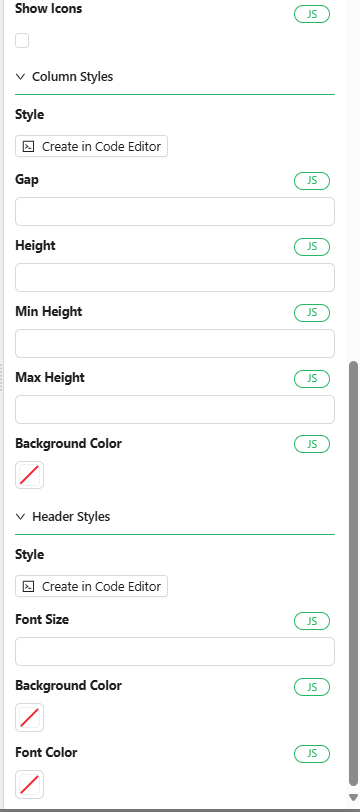
Toggles icon visibility on card headers.

Allow New Record boolean
Lets users add new items to the board. Hidden when Readonly is on.

Create Form object
The form used to create new tasks. Only shown when Allow New Record is enabled.
Allow Edit boolean
Enables in-place or modal editing of existing cards. Hidden when Readonly is on.

Edit Form object
The form used to edit existing tasks. Only shown when Allow Edit is enabled.
Data
Reference List object
The reference list used to define the board's columns. Re-select this if the reference list's items are modified after configuring the component - the item selector below does not update automatically.
Items object
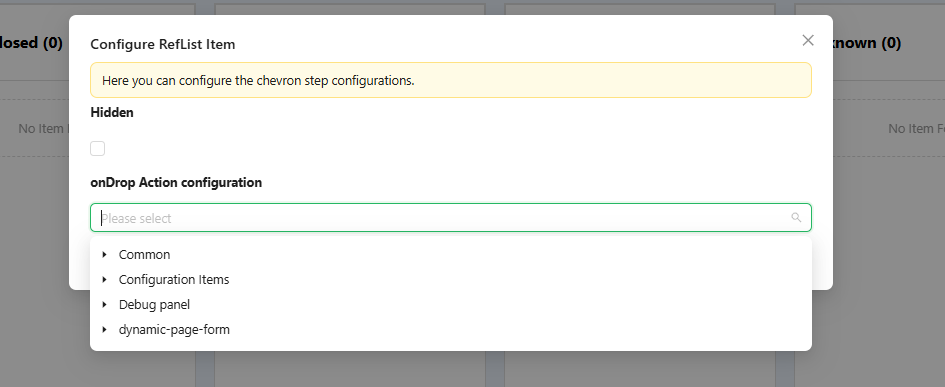
Selects which items from the chosen reference list appear as columns, and lets you reorder them and configure per-column actions (such as what happens when a card is dropped into that column, or hiding a column entirely).
Appearance
Header Styles
Header Styles applies the standard Font, Background, Shadow, and Border groups (see common properties) to each column's header, plus a Custom Styles script.
Column Styles
Gap number
The space between columns on the board.
Column Styles also applies the standard Dimensions, Background, Shadow, Border, and Margin & Padding groups (see common properties) to each column card itself, plus a Custom Styles script.
How to Configure the Component
The Kanban component is found under the Advanced group in the form designer.
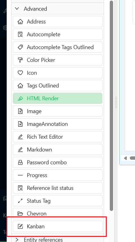
Drag it onto your form, inside a Data Table Context component.
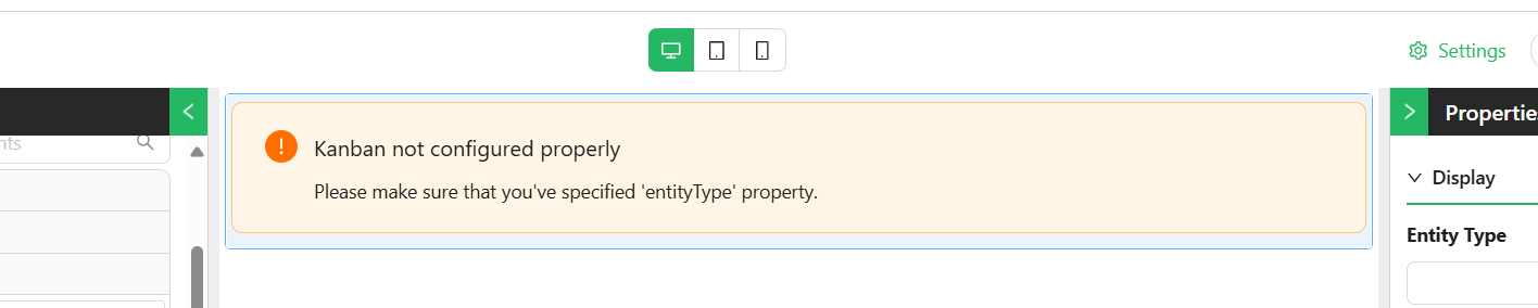
Configure its properties in the settings panel.
Select a Reference List on the Data tab to define the board's columns - for example a status reference list with items like To Do, In Progress, and Done.
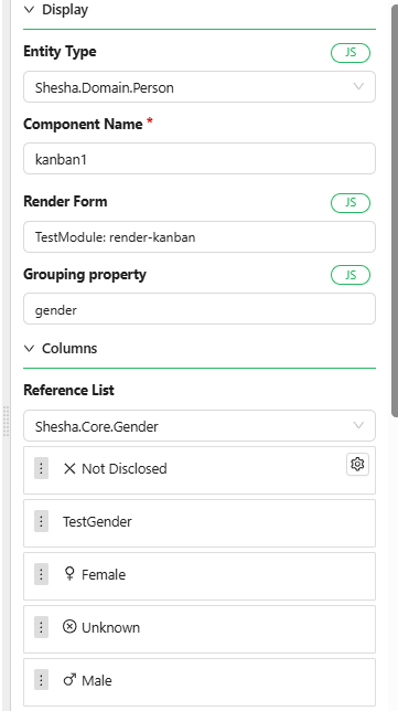
You can reorder the columns to match your workflow. Hovering over a column reveals a gear icon that opens per-column configuration, such as what should happen when a task is dropped into it, or hiding the column entirely.