DataTable
A DataTable displays records from a data source in rows and columns. You configure which columns to show, how each column looks and behaves, and whether users can add, edit, or delete records directly inside the table. A DataTable reads its data from a parent DataTableContext component, which handles fetching, filtering, sorting, and paging so the DataTable only needs to focus on display.

Get Started
This guide assumes a DataTableContext is already configured on your form. Learn how to set one up here.
Properties
The following properties are available to configure the behavior of the component from the form editor (this is in addition to common properties).
The panel is organised into three tabs: Common, Events, and Appearance. The Columns, CRUD, and Layout groups below sit on the Common tab, Row events sits on the Events tab, and the styling groups sit on the Appearance tab.
Columns
Customize Columns
Opens the column builder, where you define what the table shows. Each column maps to a field in your data source. You configure how the column header looks, how the cell renders in view mode, and what component appears when a row is being edited or created.
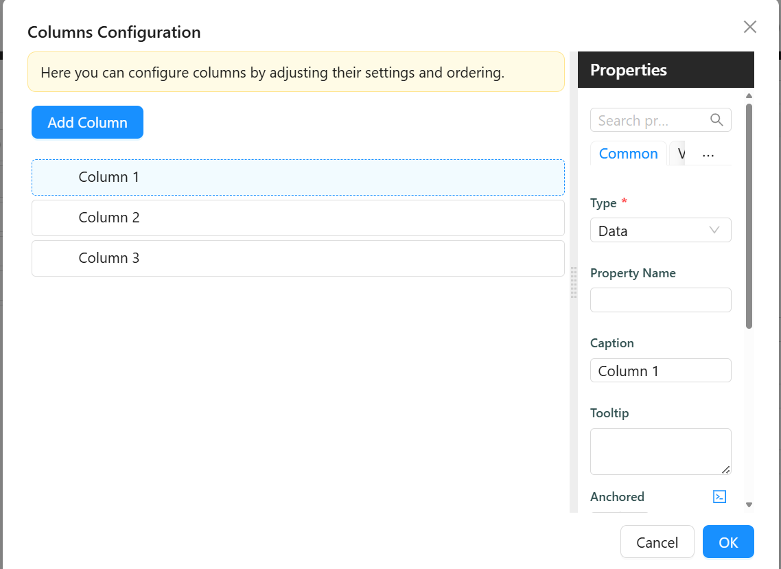
Each column in the builder has the following settings:
Type - Determines what kind of column this is and which other settings appear for it.
| Option | When to use |
|---|---|
Data | Show a field value from the record. This is the default for most columns. |
Action | Show a button or link that triggers a configurable action when clicked. |
CRUD Operations | Show a built-in set of edit, save, and delete icons for inline row editing. |
Form | Embed a small form inside the cell using a separate form definition. |
Scripts on an Action column now run with the full page context. Variables such as pageContext, form, and setGlobalState are injected and available, where in earlier versions they could arrive as undefined.
Property Name - The field name from the data source this column reads its value from. Use dot notation for nested fields, for example address.town. Applies to Data and Form column types.
Caption - The text shown in the column header. If left blank, Shesha uses the property name.
Tooltip - Short text shown when the user hovers over the column header.
Anchored - Pins the column so it stays visible when the user scrolls horizontally. Choose Left to pin to the left edge or Right to pin to the right edge.
Is Visible - Controls whether the column is shown. Uncheck this to hide a column without removing it from the configuration.
Display Component - The component used to render the cell value in view mode.
Edit Component - The component used inside the cell when the row is being edited inline.
Create Component - The component used inside the cell when a new row is being created inline. If left blank, Shesha uses the Edit Component.
Show Expanded View boolean
When enabled, each row can be expanded to show an expanded, read-only view of the record built from the table's default display components. This is limited to columns that use the default display component - columns with a custom Display Component configured are not shown in the expanded view.
Selection Mode object
Controls whether and how users can select rows. This uses the same selection model as the DataList component.
| Option | When to use |
|---|---|
None | Rows cannot be selected. Use this for a display-only table. |
Single | Only one row can be selected at a time. |
Multiple | A checkbox appears at the start of each row, and users can select several rows at once. Use this for bulk actions on the selected records. |
When Selection Mode is Single or Multiple, the On Row Select and On Selection Change events become available. See Row events.
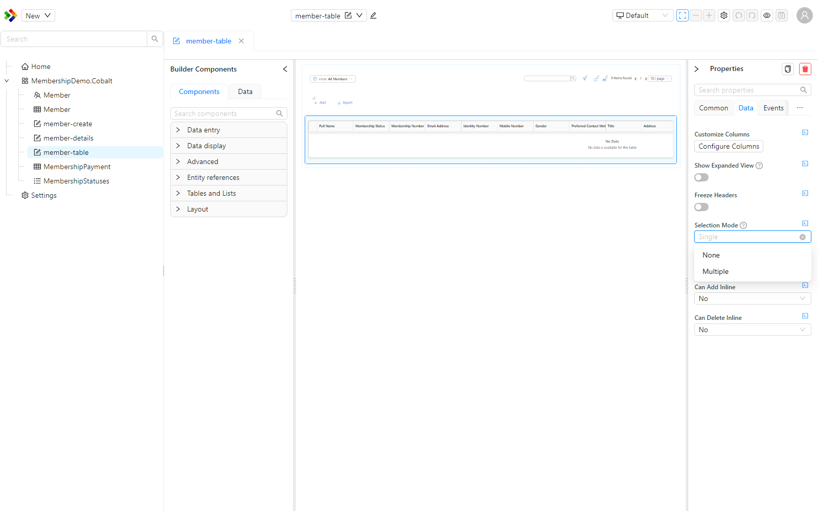
Freeze Headers boolean
When enabled, the column headers stay fixed at the top of the table while the user scrolls down through a long list of rows.
CRUD
The CRUD settings control whether users can add, edit, or delete records directly inside the table without opening a separate form.
Can Edit Inline object
Controls whether rows can be edited directly in the table.
| Option | Behaviour |
|---|---|
Yes | Inline editing is always enabled. |
No | Inline editing is always disabled. |
Inherit | Inherits the setting from the parent DataTableContext. |
Expression | Uses a JavaScript expression to decide at runtime. |
Can Edit Inline Expression function
Appears when Can Edit Inline is set to Expression. A JavaScript expression that returns true to enable inline editing or false to disable it.
Available variables:
| Variable | Type | Description |
|---|---|---|
formData | object | Current values of all fields on the parent form. |
page.state | object | Data shared by every component on the current page |
utils.moment | function | The Moment.js library, for working with dates and times |
Form type to use: Table / List View.
Example - Disable editing when the record status is closed:
return formData.status !== 3;
Row Edit Mode object
Appears when Can Edit Inline is Yes, Inherit, or Expression. Controls how many rows can be in edit mode at the same time.
| Option | Behaviour |
|---|---|
One by one | Only one row can be edited at a time. Clicking edit on another row discards any open changes. |
All at once | All rows can be edited simultaneously. Use this for bulk editing scenarios. |
Save Mode object
Appears when Can Edit Inline is Yes, Inherit, or Expression. Controls when edited row data is saved.
| Option | Behaviour |
|---|---|
Auto | Changes are saved automatically when the user moves focus away from the row. |
Manual | The user must click the Save icon on the row to commit the change. |
Custom Update URL string
Appears when Can Edit Inline is Yes, Inherit, or Expression. An optional endpoint to override the default URL that row updates are posted to. Leave blank to use the standard entity update endpoint.
Can Add Inline object
Controls whether users can create new records by adding a row directly in the table.
| Option | Behaviour |
|---|---|
Yes | Inline row creation is always enabled. |
No | Inline row creation is always disabled. |
Inherit | Inherits the setting from the parent DataTableContext. |
Expression | Uses a JavaScript expression to decide at runtime. |
Can Add Inline Expression function
Appears when Can Add Inline is set to Expression. A JavaScript expression that returns true to allow row creation or false to prevent it.
Available variables: formData, form, utils, page.
New Row Capture Position object
Appears when Can Add Inline is Yes, Inherit, or Expression. Controls where the empty new-row input appears in the table.
| Option | Behaviour |
|---|---|
Top | The new row input appears at the top of the table. |
Bottom | The new row input appears at the bottom of the table. |
Custom Create URL string
Appears when Can Add Inline is Yes, Inherit, or Expression. An optional endpoint to override the default URL that new rows are posted to. Leave blank to use the standard entity create endpoint.
New Row Init function
Appears when Can Add Inline is Yes, Inherit, or Expression. A JavaScript function that runs when a new row is first added to the table. Use it to pre-fill default values on the empty row before the user starts typing. Return an object with the field values to pre-populate.
Available variables:
| Variable | Type | Description |
|---|---|---|
formData | object | Current values of all fields on the parent form. |
page.state | object | Data shared by every component on the current page |
actions.callApi | object | HTTP client for calling APIs. Exposes get, post, put, patch, and delete |
utils.moment | function | The Moment.js library, for working with dates and times |
Form type to use: Table / List View.
Example - Pre-fill the new row with the parent form's selected person:
return {
  personId: formData.personId,
  status: 1,
};
On Row Save function
Appears when Can Add Inline or Can Edit Inline is not No. A JavaScript function that runs when a row is about to be saved. Use it to validate or transform the row data before it is posted to the server. Your function must return the data object that should be saved.
Available variables:
| Variable | Type | Description |
|---|---|---|
data | object | The current row field values. |
formData | object | Current values of all fields on the parent form. |
page.state | object | Data shared by every component on the current page |
actions.callApi | object | HTTP client for calling APIs. Exposes get, post, put, patch, and delete |
utils.moment | function | The Moment.js library, for working with dates and times |
Form type to use: Table / List View.
Example - Add a timestamp to the row before saving:
return {
  ...data,
  lastModifiedOn: utils.moment().toISOString(),
};
If On Row Save does not return a value, the row save will fail silently. Always return the full data object you want to save.
Can Delete Inline object
Controls whether users can delete rows directly from the table.
| Option | Behaviour |
|---|---|
Yes | Inline row deletion is always enabled. |
No | Inline row deletion is always disabled. |
Inherit | Inherits the setting from the parent DataTableContext. |
Expression | Uses a JavaScript expression to decide at runtime. |
Can Delete Inline Expression function
Appears when Can Delete Inline is set to Expression. A JavaScript expression that returns true to allow deletion or false to prevent it.
Available variables: formData, form, utils, page.
Form type to use: Table / List View.
Example - Only allow deleting rows that have not yet been approved:
return formData.approvalStatus !== 2;
Custom Delete URL string
Appears when Can Delete Inline is Yes, Inherit, or Expression. An optional endpoint to override the default URL used for row deletions. Leave blank to use the standard entity delete endpoint.
Row events
These events let you respond to how a user interacts with a row. Each one is an Action Configuration, so you choose an action to run, such as navigate, show a dialog, or execute a script, when the interaction happens. The row involved in the interaction is available to the action.
| Event | Fires when |
|---|---|
On Row Click | A row is clicked. |
On Row Double-Click | A row is double-clicked. |
On Row Hover | The pointer hovers over a row. |
On Row Select | A row is selected. Available when Selection Mode is Single or Multiple. |
On Selection Change | The set of selected rows changes. Available when Selection Mode is Single or Multiple. |
On Row Save Success | An inline row edit or creation has been saved successfully to the server. |
On Row Delete Success | An inline row deletion has completed successfully. |
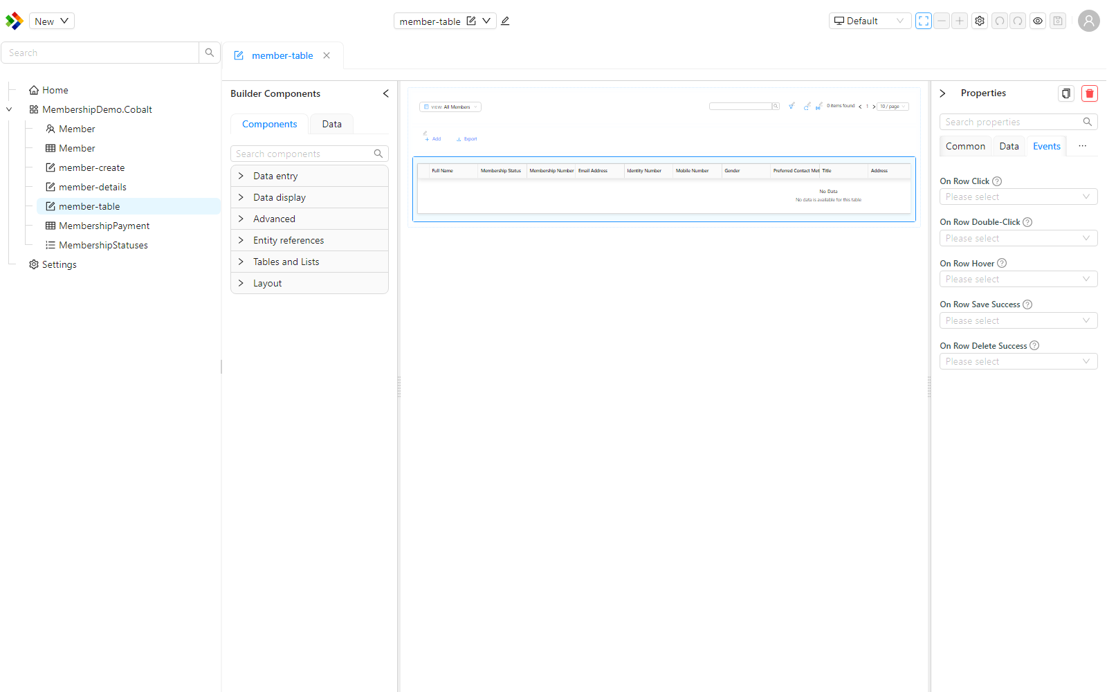
Scripts run from these events receive the full page context, including pageContext, form, and setGlobalState.
Layout
Table Container Style function
A JavaScript expression that returns a CSS style object applied to the outer wrapper around the table. Found under the Appearance tab's Custom Styles panel, alongside Table Style.
Available variables: formData, form, page.
Example - Add a border and rounded corners to the table container:
return {
  border: '1px solid #d9d9d9',
  borderRadius: '8px',
  overflow: 'hidden',
};
Table Style function
A JavaScript expression that returns a CSS style object applied directly to the table element. Found under the Appearance tab's Custom Styles panel, alongside Table Container Style.
Available variables: formData, form, page.
The standalone Min Height and Max Height settings under Layout, present in older versions, are no longer exposed on the properties panel. To constrain the table's height, set a fixed or max height in the Table Container Style script instead, for example return { maxHeight: '600px', overflowY: 'auto' };.
Appearance
The Appearance tab gives you control over how the table looks, without writing CSS. The options are grouped as follows.
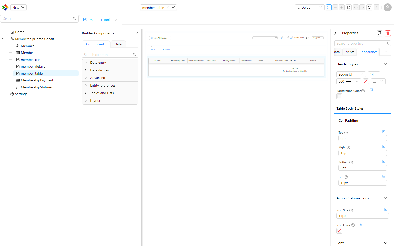
| Group | What you can control |
|---|---|
| Header styles | Header font (family, size, weight, colour, alignment) and background colour. |
| Table body styles | Cell padding (top, right, bottom, left). |
| Action column icons | Icon size and colour for the built-in CRUD action icons. |
| Font / Dimensions / Row Dimensions / Border / Background / Shadow / Margin & Padding | Generic per-device styling for the table element itself. |
| Table specific | Striped rows, hover highlight, row background, alternate row background, hover background, sort indicator colour, and (when Selection Mode is Single or Multiple) selected row background. |
| Cell styling | Cell border colour, whether cell borders are shown, and row dividers. |
The Freeze Headers option keeps the header row fixed (sticky) while the body scrolls. For one-off styling beyond these options, use the Table Container Style and Table Style functions described under Layout.
The Primary Text, Secondary Text and Icon settings for the table's empty state, present in older versions, are no longer exposed on the properties panel for DataTable.