Tabs
The Tabs component is used to organize content into separate sections or panes, where users can switch between these sections by clicking on the tabs. Each tab represents a different section, and only one section is visible at a time.

Properties
The following properties are available to configure the behavior of the component from the form editor (this is in addition to common properties). Tabs groups its settings into Common and Appearance tabs. Permissions are set on the Visible and Interaction Mode settings on the Common tab, using the lock icon beside each.
Common
Default Active Tab enum
Choose which tab should greet your users first. This dropdown lets you set the initial active tab based on tab configurations.
Tab Type card | line
Defines the visual style of your tabs.
| Option | Description |
|---|---|
Line | Sleek underline style for the minimalists. |
Card (default) | Each tab looks like a clickable card. |
Tabs
Configure Tab Panes
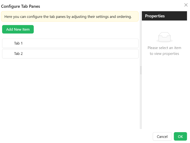
The Configure Tab Panes option is where you add the tabs. Each tab has its own settings, all on a single Common tab in the tab editor.
Name string
Internal identifier used to reference the tab.
Title string
The text displayed on the tab label.
Visible boolean
Whether the tab is shown. Switch it to a script to show a tab only under certain conditions. Permissions can be set on this setting with the lock icon beside it, so a tab can be hidden from users who do not hold a given permission.
Interaction Mode object
Whether the content of this tab can be edited.
| Option | Behaviour |
|---|---|
Inherited (default) | The tab takes the mode of the form it belongs to |
Editable | The tab's content can always be edited |
Read Only | The tab's content is always display-only |
Permissions can be set on this setting too, so a tab can be shown to everyone but edited only by certain users.
Animated boolean
Enables animated transitions when switching tabs.
Icon object
An optional icon shown beside the title.
Force Render boolean
Renders the tab's content even while the tab is not selected. Use it when something inside the tab has to run or be measured before the user opens it.
Destroy Inactive Tab Pane boolean
Removes an inactive tab's content from the page instead of keeping it hidden. This keeps a heavy form lighter, at the cost of rebuilding the tab each time the user returns to it.
Key string
A unique key for the tab.
Class Name string
An optional CSS class applied to the tab.
Tabs no longer have a separate Security tab. Set permissions on the Visible and Interaction Mode settings instead, using the lock icon next to each. Existing permission values were migrated across automatically. See Permissions.
Appearance
The Appearance tab is a per-device property router with the standard Font, Dimensions, Border, Background, Shadow, and Margin & Padding panels described in common properties, plus the settings below.
Position string
Set where your tabs appear:
- Top (default)
- Bottom
- Left
- Right
Border's corner-radius controls hide or show individual corners based on the selected Position, so the visible corners always match the side the tabs sit on.
Line Color
Only shown when Tab Type is Line. A single Color field that sets the colour of the underline indicator beneath the active tab.
Card Styles
Collapsed by default, and only relevant when Tab Type is Card. These settings style the tab buttons themselves, separately from the tab bar's own Font, Dimensions, Border, Background, and Shadow settings above.
- Font - family, size, weight, colour, and alignment for the text on each tab button.
- Dimension - width, minimum/maximum width, height, and minimum/maximum height for each tab button. This sub-panel is labelled "Dimension" (singular) on the live panel.
- Background - hidden while Tab Type is Line.
- Custom Styles - a Style script scoped to the tab buttons only.